Have A Closer Look At Pokemon Sword And Shield’s Battle User Interface
During this week’s Pokemon Direct, we had a first glimpse at the battle UI for Pokemon Sword and Shield.
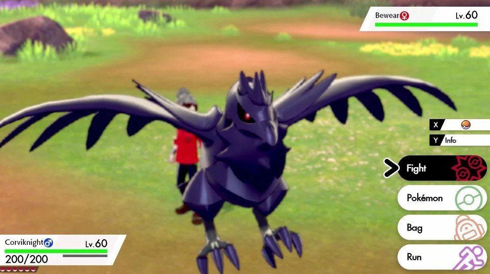
After a decade of so on Nintendo DS and 3DS, the mainline core Pokemon RPG series is returning to one screen on Nintendo Switch. Pokemon Sword and Shield’s battle UI looks like this:

As you can tell, details on your Pokemon and the number of Pokemon you have in your party could be found on the bottom left of the screen, while details of the opposing Pokemon in battle could be found on the top right corner.
The menu options “Fight”, “Pokemon”, “Bag”, and “Run” have been relegated to the bottom right corner of the screen, so it wouldn’t obstruct the player’s view of the battle scene.
What do you think of the new user interface? Let us know in the comments.
