Rakuten Changes Logo, Looks Too Similar To Team Rocket’s Logo
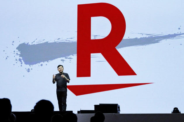
Earlier this month, Japanese e-commerce giant Rakuten announced it has changed its logo into a giant red “R” with a dash underneath it.
Here’s how the logo looks like:

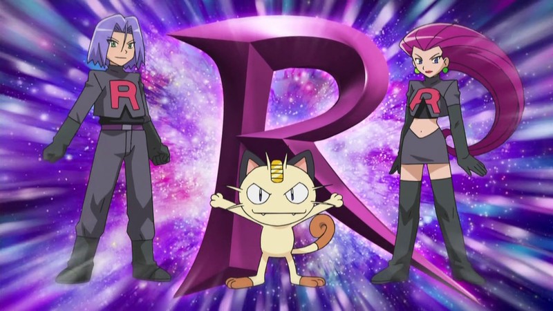
Many Japanese Pokemon fans realized that Rakuten’s new logo resembled Team Rocket’s logo. Many started saying that “Rakuten has turned into Team Rocket”, which has turned into some sort of joke.

What do you think? Let us know in the comments.
