McDonald’s Asked Nintendo To Make The M On Mario’s Hat Look Like Its Logo
French paper Le Monde recently published an interview with 82 year old Yoichi Kotabe, the character designer of Mario and other Super Mario characters.
Kotabe first talked about how he entered the video game industry. Before working for Nintendo, Kotabe was working at Toei Animation. His colleague, Hiroshi Ikeda, moved to Nintendo and was in charge of developing Super Mario Bros. Ikeda called Kotabe and asked him for his help in animating the Super Mario Bros. game.
Apparently Kotabe accepted this job because he was working as a freelancer at that time, and he was frustrated that he couldn’t “define the lines” of a project.
Kotabe’s first assignment at Nintendo was to create reference images for other companies to use in their products, so he drawn artwork of Mario dancing, in a Kimono, cowboy suit, and even a jacket for Super Mario Bros. 3.
Interestingly, Kotabe asked Shigeru Miyamoto, the world’s most famous video game developer, about Mario’s personality. Miyamoto told Kotabe the following words:
“Do what you want, but Mario does not kill.”
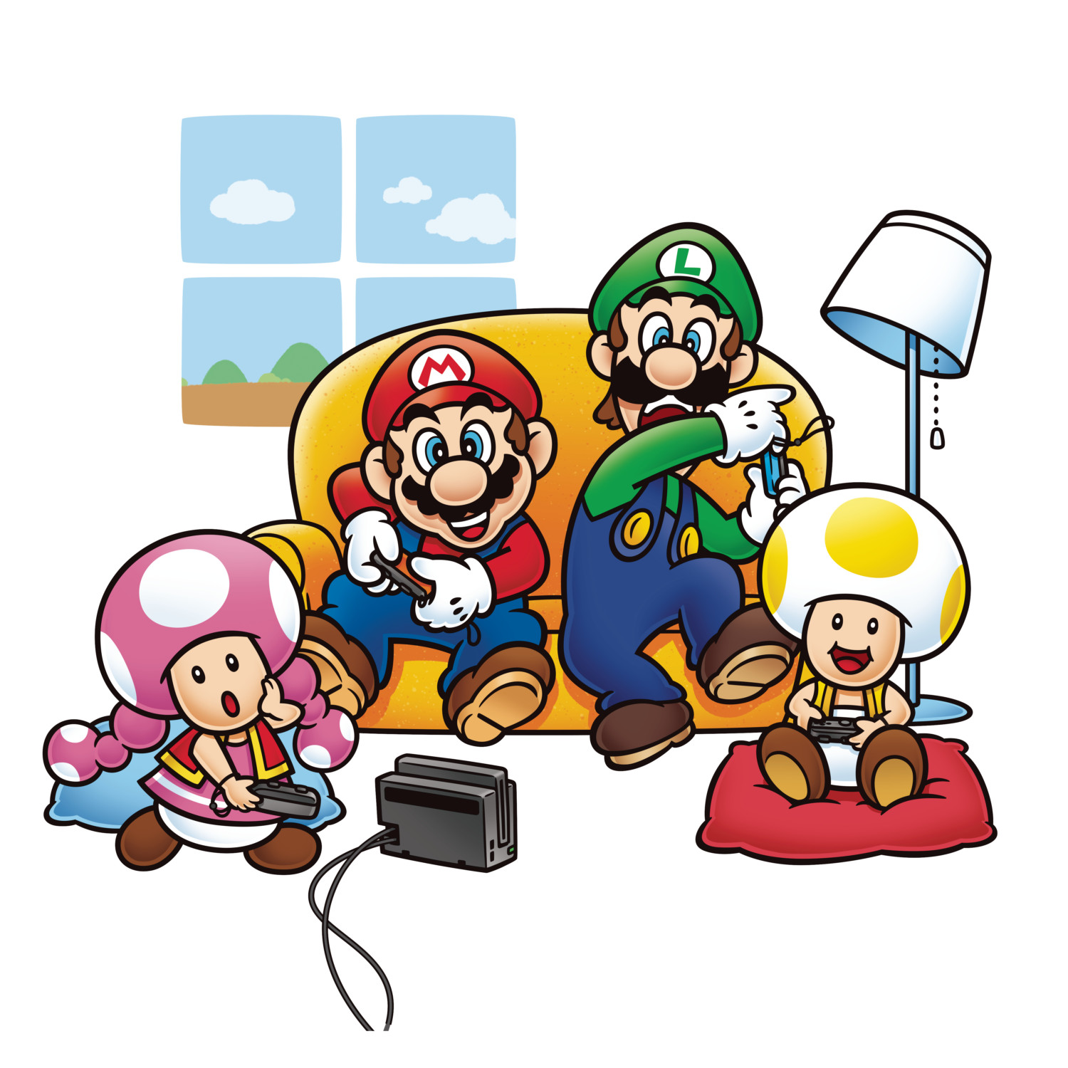
Kotabe then worked on defining the “M” on Mario’s cap, and made sure it didn’t look too similar to the iconic McDonald’s golden arches. The fast food chain reportedly asked Nintendo to make the M on Mario’s cap resemble the golden arches, but of course Nintendo did not proceed with their request.
What do you think? Let us know in the comments!
