PlatinumGames Shares How Astral Chain’s User Interface Was Made
PlatinumGames has posted the latest development blog entry for Astral Chain in English today.
In the latest blog we learn how the user interface was conceptualized and created for Astral Chain. Read on below:
Hello, everyone! I’m Rui Onishi, lead UI artist for ASTRAL CHAIN. Writing these devblogs to share part of the development process with all of you is a fun part of releasing a new game, and now I’m happy to give you an inside look into the creation of ASTRAL CHAIN’s user interface. There’s a lot to cover, though, so I’m not going into this alone!
Three other user interface artists helped me out in making various parts of ASTRAL CHAIN’s UI, and I’ve asked each of them to write a bit about their work! With so many people contributing, we’ve had to split this devblog into two parts. I’d like to start things off with some background information about what a UI artist does, and the design concept for ASTRAL CHAIN’s interface.
What a UI Artist Does Just one page from my notebook of design sketches. Does anything look familiar?
UI artists design and create the game’s user interface: lock-on cursors, health bars, dialogue boxes, map screens, title menus, weapon and item icons, so on and so forth. On top of designing and making all these UI elements themselves, we also create animations for them, so that they react properly as they appear, disappear and respond to user interaction.
ASTRAL CHAIN UI Design Concept This screenshot from our development environment shows the Legatus Menu, when it was still a work in progress.
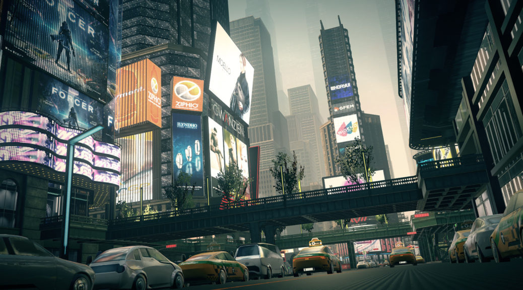
A game’s user interface needs an overall design concept, just like characters and environmental art do! The main defining characteristic of ASTRAL CHAIN’s setting is that it’s a technologically advanced near future, with plenty of information and detail shown through holograms.I took on the mantle of lead UI designer right as the development team was focused on strengthening that setting. Thus I had a goal as I designed the UI: Make it look and feel like a hologram projected in physical space, as if it were something the main character uses themselves, not just the player’s way to interact with the game from outside.
The UI that was already implemented at the time had a flat design and an orderly layout. Its planar layout and simplicity made it look a bit like futuristic paperwork from some government office or police department.
After a bit of thought, I decided that the existing flatness and official “paperwork” motif was appropriate for ASTRAL CHAIN’s setting. Not to mention there’s a lot of information that needs to be shown onscreen in ASTRAL CHAIN; the simplicity of the existing design suited that very well. So we would be keeping that general idea.
I took the existing UI and tried showing it from different angles. I offset some of the meticulously-ordered windows to make it look as if they were subtly tilting into the background. Little touches like this made the UI look more like it was projected into space in front of the player character.Then it was time to adjust and animate. I gave the UI high-contrast color schemes to fit in with the overall graphical tone of the backgrounds and Legions. The UI animations are smooth and use sharp lines and digital noise to add to the sci-fi feel.
