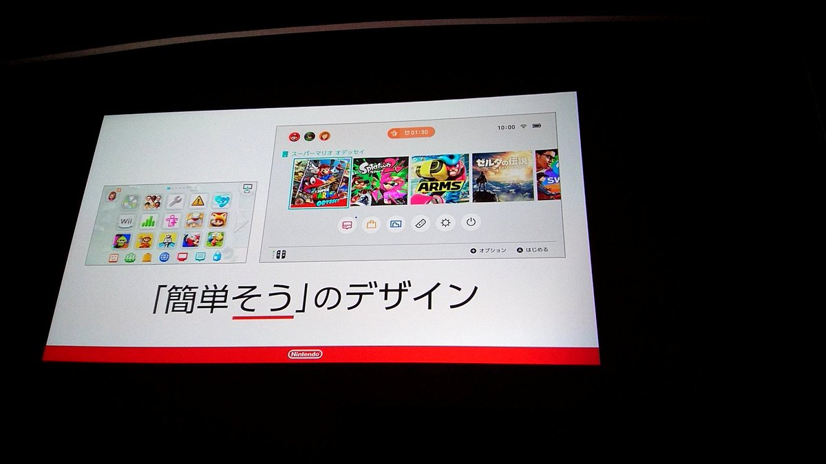

During CEDEC 2018, Nintendo Switch user interface designers shared insights on how the Switch menu was conceptualized and designed.
When deciding on what kind of operating system (OS) Nintendo envisioned, the developers decided that it should be easy to use, light to use, and feature games as prominently as possible. As the OS has many features, they wanted to make sure people feel it’s easy to use.
Some of the techniques employed include separating games from services, adjusting the size, color, and density of icons, top-to-bottom approach, and making the screen less crowded as possible. Through these techniques, it helps to keep the menu tidy and in order.
When designing the button layout for the Nintendo Switch menu, Nintendo implemented a way that many people would agree in expecting how the cursor or something would move. Sound effects and text messages (errors, notifications, warnings, etc) are used together in order to make the user easily understand what is happening.
A key focus on making the Switch OS as light as possible was to follow the NES and Famicom’s simplicity – turning on the console immediately boots up the game. To picture how users use an operating system, Nintendo described it like driving a car – understanding what’s going on first, take action, and finally waiting for the result.
By cutting down the waiting time a player spends, the Switch menu’s design resources take up less than 200kb of memory. Animations have been made as short as possible, and certain actions have been kept to help users navigate.
Cutting down the number of actions users have to take was also prioritized, and the default cursor is always placed on Yes rather than No when exiting games. The OS also avoids asking “are you sure?” too much, trusting users know what they want. Sometimes, text is used instead of icons, as some icons may not be easily understood by users.
Finally, Nintendo explained the reason behind the lack of background music for the menu – they want users to quickly access games. Nintendo also engineered sound effects on the menu to what they call “animation sound effects” – sound effects with different effect for each line; adjusted rhythm and tempo, and call-n’-response.
The Kit and Krysta YouTube channel has shared an opening day tour of Nintendo SAN…
The official Nintendo TOKYO store in Japan has fully completed renovations started in February on…
Following the roll out of Nintendo Switch 2 game cases at Japanese retailers, display units…
The Nintendo Today! app has shared a video showing how you can find your misplaced…
Good news for Nintendo fans - Nintendo has confirmed that they currently have no plans…
The Pokemon Company has announced some special distributions for the 2025 Pokemon North American International…